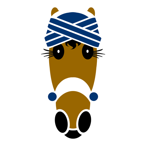
Hello and welcome. Thank you for stopping by. We have one of your all time favorite designs today. It has always been a big hit. And now it has a new name and a fresh look.
Jenna
Vivian renamed this design Jenna following a “write in” by Hattingdon fans. What a lovely name they chose.
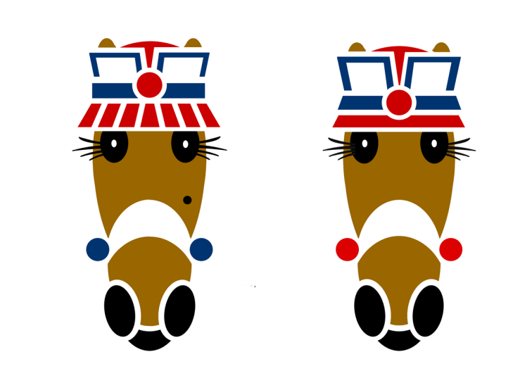
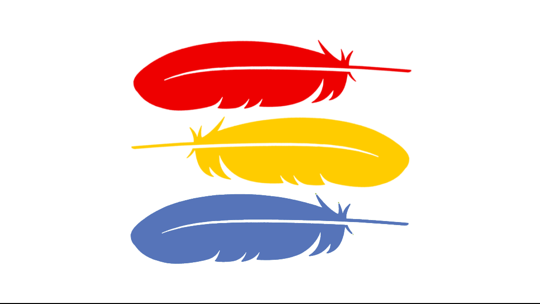
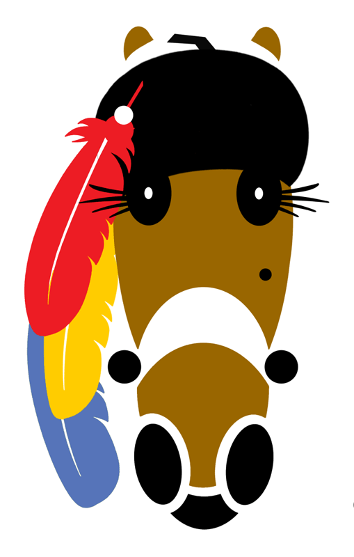
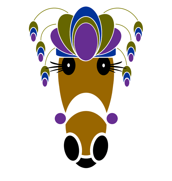
The newly named Jenna design features a fabulous black beret with a cascading trio of feathers in red, yellow and . . . now blue. We have all drawn to this design. Just love it. See Color Meanings below.
Jenna Hattingdon.
Color meanings
Color-meanings.com reveals and explains the symbolism and meanings of feather colors.
• RED. “Red is the color of the Root Chakra, which is the source of energy of life, and vitality. Red is one of the fascinating colors that uncover various symbolisms, meanings, and associations. It is usually linked with our strong emotions, such as love, desire, and anger. From red hair to the red carpet in events, it is a color that’s regarded as a head-turner due to its warm, bright hues.
Red is a primary color. It represents passion, warmth, and sexuality, but it is also known as a color that stands for danger, violence, and aggression. Red sits between violet and orange on the color wheel. Colors that are similar to red are rose red and red-orange. The hex code for the color red is #FF0000.”
• YELLOW. “Yellow is the representative color for the Solar Plexus Chakra, therefore, the yellow feather is connected to the Gut Instinct. It is charged with the sun’s energy, and is pulsing with blessings and wisdom.
Colors make your brain release different chemicals. In the case of yellow, this color makes the brain release serotonin, which in turn can make you happy! A yellow feather also draws attention to intelligence and mental alertness, joy, cheerfulness, and playfulness.”
• BLUE. “Blue is a symbol of loyalty, peace, and relaxation. It’s a bold color that goes well with a variety of other colors, and people all over the world are drawn to its positive connotations.
Blue is the most common favorite color around the world, and it’s beloved by people of all ages and genders. It’s unclear why so many people adore the color blue, but it likely has to do with how calming it is. It’s also the color we see surrounding us in the sky and water, so it may be a familiar hue that people feel comfortable around.”
• GREEN. The color of harmony and health. Green is a generous, relaxing color that revitalizes our body and mind. It balances our emotions and leaves us feeling safe and secure. It also gives us hope, with promises of growth and prosperity, and it provides a little bit of luck to help us along the way.
Most prominently found in nature, the color green embodies rich foliage, lush greenery, and vast landscapes. This earthy hue is commonly associated with Mother Earth, which is why it’s thought to be calming and ubiquitous. Offering relaxation, green soothes with its gentle and peaceful undertones. Green squelches chaos, making it a force to be reckoned with.
Learn more at Color-meanings.com »
A ‘Hatful of Smiles’
Contents © Vivian J Grant. All Rights Reserved.
Updated 16 January 2026.